Porpora Prestige
Why Mid Grey: Picked to read as neutral against this tile's red.Ask your tiler for Ultracolor Plus 113 (Mapei) or Fugabella Color 07 (Kerakoll).
Take the tonal tone for a room that leans into the tile, or the neutrals to let it lead. Coloured tiles do the talking. Walls should step back into a soft neutral.
- 45° Mitre · Two tiles cut at 45° and butted together. No metal, no plastic. Crisp.
- Pencil bullnose · A separately-fired pencil rail in the matching tile finish, sat on the cut edge.
- Schlüter JOLLY · PVC, anodised aluminium, or brushed brass L-profile that caps the cut tile edge.
- Schlüter RONDEC · Quarter-round metal trim that turns the corner with a soft rolled edge.
- Schlüter SCHIENE · Right-angle metal edge that finishes a tile where it meets a different material.
Polished or honed marble-look on a wall — mitre delivers the invisible line that justifies the tile.
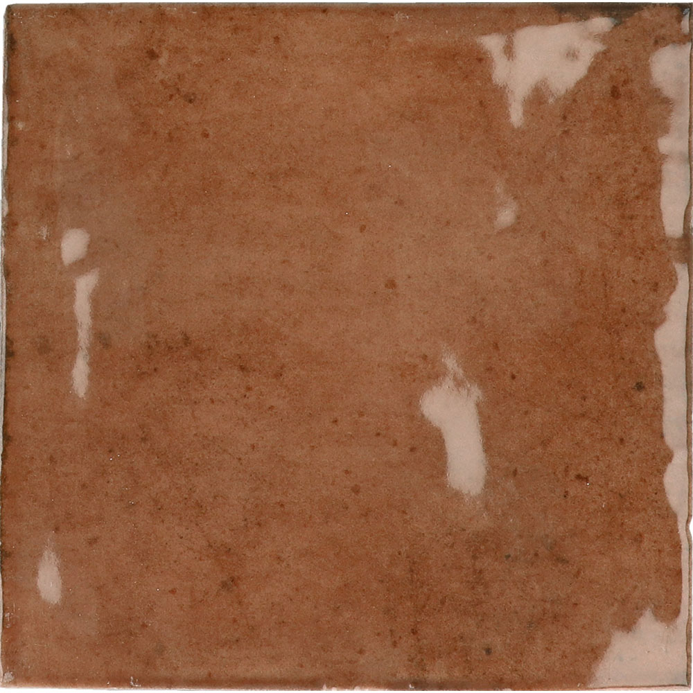
Porpora Prestige. 100 × 100 × 9mm porcelain in a polished finish, from the Marmoré studio collection.
Need a large quantity? Request a wholesale quote for projects over 500 m² →
Not quite this one? Upload a photo and find a similar tile →
Love it? Design a whole room around this tile →
Stocked in Melbourne, shipped to NZ on confirmed order.
Cross-Tasman lead time 6–8 weeks via consolidated container.
Freight quoted per order. Samples posted to NZ from $12.
Approx. $145.80 NZD/m² at current FX. AUD invoice issued.
- ✓Polished finish
- ✓Shade variation NA
- ✓Made in Italy
Tell us the area, we'll work out the boxes. Wastage included.
- Free delivery over $1,500
- 60-day change-of-mind returns
- Australian warranty
- Samples from $15
What you’re really specifying
The material
Porcelain is fired denser and harder than ordinary ceramic — low water absorption, high resistance to scratching and frost, and colour that runs through a rectified, dimensionally exact body. It is the workhorse of a modern Australian home.
The finish
A polished finish mirrors light to make a space feel larger and more formal. Best kept to lower-traffic or dry zones where the shine stays pristine.
The format
At 100 × 100 × 9mmmm this is a versatile square format that lays cleanly in a grid or on the diagonal, and suits both floors and walls.
The colour
Tonally this sits in the red family. Light changes everything with tile, so order a sample and live with it on your wall or floor across a day before you commit — what reads warm at 9am can read cool by dusk.
Want it in your room before deciding? See this tile in your space →
Reviews
No reviews yet — be the first.
Bought this tile? Share how it landed in your space. Real photos welcome — they help the next person spec with confidence.
Questions about Porpora Prestige?
Our AI concierge answers from this tile’s spec sheet and our journal. For pricing on large jobs or trade enquiries, the studio replies within a business day.
Three to spec next to this
 In a room
Cremisi Pisa
75 × 75 × 9mm · matte
Made to order
“Burgundy matte mosaic grounds the polished red—same tonal family, format contrast adds depth without competing”
 In a room
Cobalto Crepuscolo
100 × 100 × 8mm · polished
Made to order
“Deep polished blue creates a classic jewel-tone contrast against the red, same 100×100 format keeps it cohesiv”

Onice Scuro Raffinato
100 × 100 × 8mm · polished
Made to order
“Shared polished finish and identical format; the pink-onyx tone softens the red scheme without breaking its ri”
More like this
 In a room
Piombo Luna
100 × 100 × 10mm · matte
In a roomCremisi Pisa
75 × 75 × 9mm · matte
Made to order
Onice Scuro Raffinato
100 × 100 × 8mm · polished
Made to order
 In a room
Felce Australe
100 × 100 × 10mm · polished
 In a room
Portoro Australe
100 × 100 × 10mm · polished
In a roomCobalto Crepuscolo
100 × 100 × 8mm · polished
Made to order